At some point, I might need to get one of these hats, although I have the throwback white & orange paneled cartoon bird hats already.

Although the new item I most likely will end up with is one of these orange jerseys, since the O's orange look is my favorite.

And I know a certain wife that has a thing for hoodies that might like this new design.

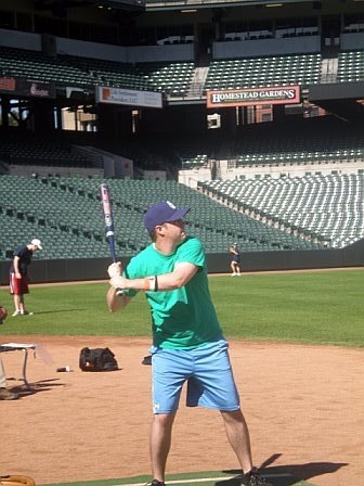
I mostly took these pictures to show the Camden Yards 20th Anniversary patches on the right sleeves. I guess the Baltimore script logo is updated as well, but it's a pretty subtle change.


Overall, I'm a big fan of the reincorporation of the cartoon bird logo and a huge proponent of officially bringing back the orange uniforms, so it was a good day in Birdland.


7 comments:
I like the orange jerseys, but am not a fan of the new home hats with the white panel. It's a little too retro for me. I'd prefer they wear the new road hats all the time.
I like the new logo - if fitted caps didn't cost almost $40 these days, I'd probably want one.
Not a fan of the orange jersey. Orange clothes should be left for school crossing guards. :)
I'm glad they brought back this uniform too.
As an aside, does anyone want/need to trade for a copy of the Brooks Robinson program that they gave away at the dedication ceremony for his statue on 10-22-11? I have an extra one in mint condition and would be willing to trade/sell it. Just post something here if you're interested. Thanks!
You and your beautiful need to provide a certain pair of "Rents with items that you might want for Christmas. You are NOT allowed be buy new hats, hoodies or jerseys before Christmas - smile
I really don't get the dislike for orange jerseys. I think they're great (Giants jerseys excluded, of course).
Anytime I saw an Orioles player with an orange jersey on a baseball card in the '70s, I wished my favorite team wore orange.
Now if only they would bring back the orange pants to complete the pumpkin look...
I've always been a big fan of the cartoon bird, but this new version doesn't do it for me. I think it's the clearly detailed "Os" on his hat. The old cartoon birds were always wearing hats, but the logo was just a little squiggle, barely recognizable as one of the older "bird" logos. Maybe this'll grow on me, but for now I'll be looking for "retro" hats with the good old ornithological bird.
All the new jerseys look great, especially the orange alternate. That's fantastic.
Post a Comment